-

Want a paper copy?
You can now buy the book!
All royalties go to the Cystic Fibrosis Trust.Spotted an error? Have comments?
Let us know!Get hands on with source code for the book.
2.6 Learning the guess probabilities
You might expect that inferring the guess probabilities would require very different techniques than we have used so far. In fact, our approach will be exactly the same: we add the probability values we want to learn as new continuous random variables in our model and use probabilistic inference to compute their posterior distributions. This demonstrates the power of the model-based approach – whenever we want to know something, we introduce it as a random variable in our model and compute it using a standard inference algorithm.
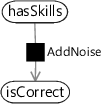
Let’s see how to modify our model to include the guess probabilities as random variables. To keep things consistent, we’ll also add in a variable for the mistake probability (actually the no-mistake probability) but we’ll keep this fixed at a 10% chance of making a mistake. To start with, we’ll change how we write the AddNoise factor.
|
|
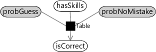
Figure 2.25 shows how the existing AddNoise factor (which has the guess and no-mistake probabilities hard-coded at 0.2 and 0.9 respectively) can be replaced by a general Table factor which takes these probabilities as additional arguments. We can then set these arguments using two new random variables, which we name as probGuess and probNoMistake. Inferring the posterior distribution over the variable probGuess will allow us to learn the guess probability for a question. But before we can do this, we must first see what kind of distribution we can use to represent the uncertainty in such a variable.
Representing uncertainty in continuous values
The two new variables probGuess and probNoMistake have a different type to the ones we have encountered so far: previously all of our variables have been binary (two-valued) whereas these new variables are continuous (real-valued) in the interval 0.0 to 1.0 inclusive. This means we cannot use a Bernoulli distribution to represent their uncertainty. In fact, because our variables are continuous, we need to use a distribution based on a probability density function – if you are not familiar with this term, read Panel 2.4.
When we want to represent the uncertainty in a continuous variable, such as a person’s height, apparently reasonable statements like “There is an 80% chance that his height is 1.84m” don’t actually make sense. To see why, consider the mathematically equivalent statement “There is an 80% chance that his height is 1.840000000… m”. This statement seems very unreasonable, because it suggests that, no matter how many additional decimal places we measure the height to, we will always get zeroes. In fact, the more decimal places we measure, the more likely it is that we will find a non-zero. If we could keep measuring to infinite precision, the probability of getting exactly 1.84000… (or any particular value) would effectively vanish to nothing.
So rather than refer to the probability of a continuous variable taking on a particular value, we instead refer to the probability that its value lies in a particular range, such as the range from 1.835m to 1.845m. In everyday language, we convey this by the accuracy with which we express a number, so when we say “1.84m”, we often mean “1.84m to the nearest centimetre”, that is, anywhere between 1.835m and 1.845m. We could represent a distribution over a continuous value, by giving a set of such ranges along with the probability that the value lies in each range, such that the probabilities add up to one. For example:
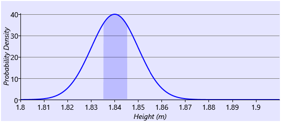
This approach can be useful but often also causes problems: it introduces a lot of parameters to learn (one per range); it can be difficult to choose a sensible set of ranges; there are discontinuities as we move from one range to another; and it is hard to impose smoothness, that is, that probabilities associated with neighbouring ranges should be similar. A better solution is to define a function, such that the area under the function between any two values gives the probability of being in that range of values. Such a function is called a probability density function (pdf). For example, this plot shows a Gaussian pdf (we’ll learn much more about Gaussians in Chapter 3): Excel
Excel CSV
CSV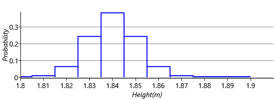
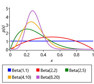
We need a distribution whose density function can represent both our prior assumption “the probability that they guess correctly is about 20% for most questions but could vary up to about 60% for very guessable questions” and also the posterior over the guess probabilities, once we have learned from the data. The distribution should also be restricted to the range 0.0 to 1.0 inclusive. A suitable function would be one that could model a single ‘bump’ that lies in this range, since the bump could be broad from 20%-60% for the prior and then could become narrow around a particular value for the learned posterior. A distribution called the beta distribution meets these requirements. It has the following density function:
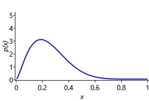
where B() is the beta function that the distribution is named after, which is used to ensure the area under the function is 1.0. The beta density function has two parameters, and that between them control the position and width of the bump – Figure 2.26a shows a set of beta pdfs for different values of these parameters. The parameters and must be positive, that is, greater than zero. The mean value dictates where the centre of mass of the bump is located and the sum controls how broad the bump is – larger means a narrower bump. We can configure a beta distribution to encode our prior assumption by choosing and , which gives the density function shown in Figure 2.26b.
We want to extend our factor graph so that the prior probability of each probGuess variable is:
Notice the notation here: we use a lower-case to denote a probability density for a continuous variable, where previously we have used an upper-case to denote the probability distribution for a discrete variable. This notation acts as a reminder of whether we are dealing with continuous densities or discrete distributions.
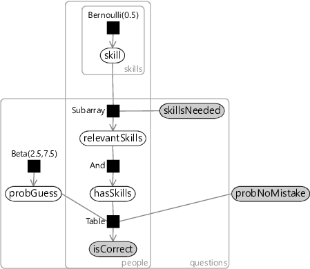
Taking the factor graph of Figure 2.19, we can extend it to have the guess probabilities included as variables in the graph with this distribution as the prior. One other change is needed: to infer the guess probabilities, we need to look at the data across as many people as possible (it would be very inaccurate to try to estimate a guess probability from just one person’s answer!). So we must now extend the factor graph to model everyone’s results at once, that is, the entire dataset. To do this, we add a new plate to our factor graph which replicates all variables that are specific to each person (which are: skill, relevantSkills, hasSkills and isCorrect). Since we are assuming that the guess probabilities for a question are the same for everyone, probGuess is placed outside the new plate, but inside the questions plate. Since the no-mistake probability is assumed to be the same for everyone and for all questions, probNoMistake is placed outside of all plates. The final factor graph, of the entire data set, is shown in Figure 2.27.
|
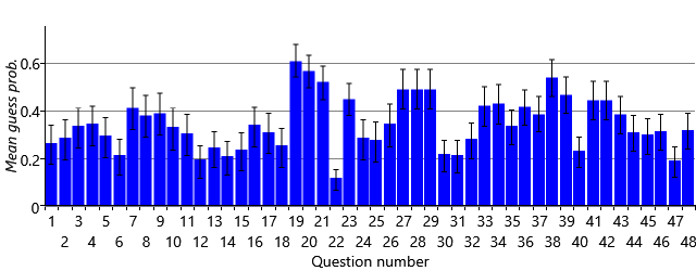
We can run inference on this graph to learn the guess probabilities. Even now that we have continuous variables, we can essentially run loopy belief propagation on the graph. The only modification we need is a change to ensure that the uncertainty in our guess probabilities is always represented as a beta distribution (this modified form is called expectation propagation and will be described fully in the next chapter). After running inference, we get a beta distribution for each question representing the uncertain value of the guess probability for that question. The beta distributions for some of the questions are shown in Figure 2.28 (we show only every fifth question, so that the figure is not overwhelmed by too many curves).
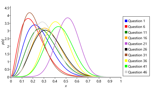
The first thing to note is that the distributions are all still quite wide, indicating that there is still substantial uncertainty in the guess probabilities. This is not too surprising since the data set contains relatively few people and we only learn about question’s guess probability from the subset of those people who are inferred not to have the skills needed for a question. For question 1, where we assume pretty much everyone has the (Core) skill needed, the posterior distribution is very close to the prior (compare the curve to Figure 2.26b) since there is hardly any data to learn the guess probability from, as almost no one is guessing this question. Several of the questions (such as 11, 16 and 26) have posteriors that are shifted slightly to the right from the prior, suggesting that these are a bit easier to guess than 1-in-5. Most interestingly, the guess probabilities for some questions have been inferred to be either quite low (questions 6, 31) or quite high (question 21, 36, 41). We can plot the posteriors over the guess probabilities for all of the questions by plotting the mean (the centre of mass) of each along with error bars showing the uncertainty (Figure 2.29). This shows that a substantial number have a guess probability which is higher than 0.2.
Just as a reminder – we have learned these guess probabilities without knowing which people had which skills, that is, without using any ground truth data. Since it doesn’t have ground truth, the model has had to use all the assumptions that we built into it, in order to infer the guess probabilities.
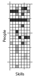
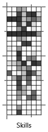
We can now investigate whether learning the guess probabilities has improved the accuracy of the skills we infer for each person. Figure 2.30 shows the inferred skill posteriors for the old model and for the new model with learned guess probabilities. Visually, it is clear that the new probabilities are closer to the ground truth skills, which is great news!

Measuring progress
As well as visually inspecting the improvements, it is also important to measure the improvements numerically. To do this, we must choose an evaluation metric which we will use to measure how well we are doing. For the task of inferring an applicant’s skills, our evaluation metric should measure how close the inferred skill probabilities are to the ground truth skills.
A common metric to use is the probability of the ground truth values under the inferred distributions, since this will be high when the correct value has high probability (which we want) and low when the correct values has low probability (which we do not want). These probabilities can often get very small, which makes them hard to work with. Instead we can take the logarithm of the probability, since logarithms allow small probabilities to be compared more easily – this metric is referred to as the log probability.
If the inferred probability of a person having a particular skill is , then the log probability metric equals if the person has the skill and if they don’t. If the person does have the skill then the best possible prediction is , which gives log probability of (the logarithm of one is zero). A less confident prediction, such as will give a log probability with a negative value, in this case . The worst possible prediction of gives a log probability of negative infinity. This tells us two things about this metric:
- Since the perfect log probability is zero, and real systems are less than perfect, the log probability will in practice have a negative value. For this reason, it is common to use the negative log probability and consider lower values (values closer to 0) to be better.
- This metric penalises confidently wrong predictions very heavily, because the logarithm gives very large negative values when the probability of the ground truth is very close to zero. This should be taken into account particularly where there are likely to be errors in the ground truth.
It is useful to combine the individual log probability values into a single overall metric. To do this, the log probabilities for each skill and each person can be either averaged or added together to get an overall log probability – we will use averaging since it makes the numbers more manageable. Notice that the best possible overall score (zero) is achieved by having where the person has the skill and where they don’t – in other words, by having the inferred skill probability matrix exactly match the ground truth skill matrix.
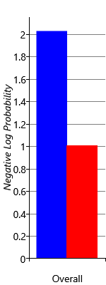
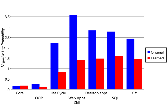
Figure 2.31a shows the negative log probability averaged across skills and people, for the original and improved models. The score for the improved model is substantially lower, indicating that it is making quantitatively much better predictions of the skill probabilities. We can investigate this further by breaking down the overall negative log probability into the contributions for the different skills (Figure 2.31b). This shows that learning the guess probabilities improves the log probability metric for all skills except the Core skill where it is about the same. This is because almost everyone has the Core skill and so the original model (which predicted that everyone has every skill) actually did well for this skill. But in general, in terms of log probability our new results are a substantial improvement over the original inferred skills.
A different way of measuring progress
It is good practice to use more than one evaluation metric when assessing the accuracy of a machine learning system. This is because each metric will provide different information about how the system is performing and there will be less emphasis on increasing any particular metric. No metric is perfect – focusing too much on increasing any one metric is a bad idea since it can end up exposing flaws in the metric rather than actually improving the system. This is succinctly expressed by Goodhart's law which can be stated as
“When a measure becomes a target, it ceases to be a good measure.”
Using multiple evaluation metrics will help us avoid becoming victims of Goodhart’s law.
When deciding on a second evaluation metric to use, we need to think about how our system is to be used. One scenario is to use the system to select a short list of candidates very likely to have a particular skill. Another is to filter out candidates who are very unlikely to have the skill, to make a ‘long list’. For both of these scenarios, we might only care about the ordering of people by their skill probabilities, not on the actual value of these probabilities. In each case, we would select the top people, but for the shortlist would be small, whereas for the long list would be large. For any number of selected candidates, we can compute:
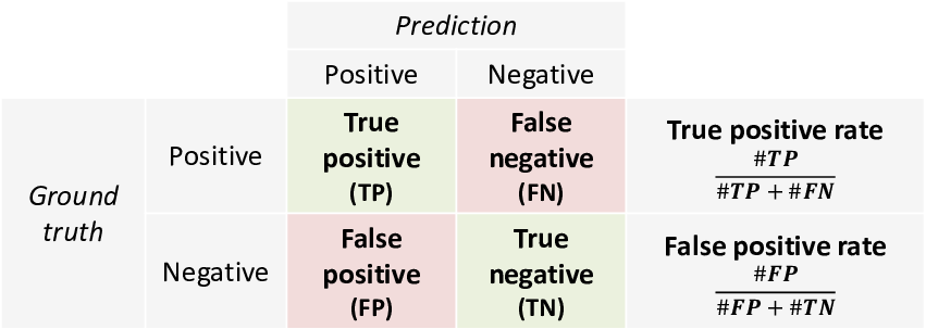
- the fraction of candidates who have the skill that are correctly selected – this is the true positive rate or TPR,
- the fraction of candidates who don’t have the skill that are incorrectly selected – this is the false positive rate or FPR.
The terminology of true and false positive predictions and their corresponding rates is summarised in Table 2.7.
In general, there is a trade-off between having a high TPR and a low FPR. For a shortlist, if we want everyone on the list to have the skill (FPR=0) we would have to tolerate missing a few people with the skill (TPR less than 1). For a long list, if we want to include all people with the skill (TPR=1) we would have to tolerate including some people without the skill (FPR above 0). A receiver operating characteristic curve, or ROC curve [Fawcett, 2006], lets us visualise this trade-off by plotting TPR against FPR for all possible lengths of list . The ROC curves for the original and improved models are shown in Figure 2.32, where the TPR and FPR have been computed across all skills merged together. We could also have plotted ROC curves for individual skills but, since our data set is relatively small, the curves would be quite bumpy, making it hard to interpret and compare them.
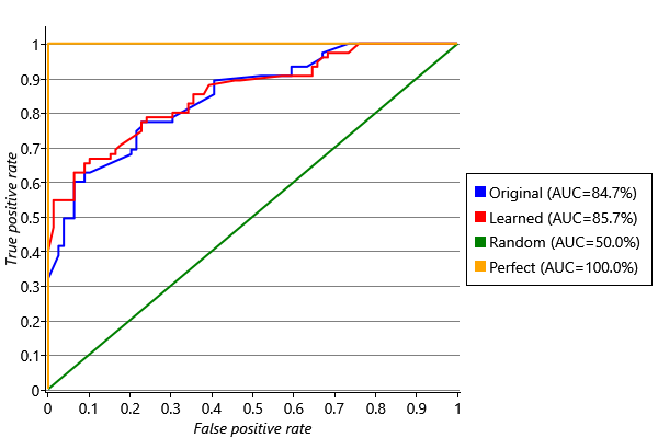
Figure 2.32 immediately reveals something surprising that the log probability metric did not: the original model does very well and our new model only has a slightly higher ROC curve. It appears that whilst the skill probabilities computed by the first model were generally too high, they were still giving a good ordering on the candidates. That is, the people who had a particular skill had higher inferred skill probabilities than the people who did not, even though the probabilities themselves were not very accurate. A system which gives inaccurate probabilities is said to have poor calibration. The log probability metric is sensitive to bad calibration while the ROC curve is not. Using both metrics together lets us see that learning the guess probabilities improved the calibration of the model substantially but improved the predicted ordering only slightly. We will discuss calibration in more detail in Chapter 4, particularly in Panel 4.3.
The ROC curve can be used as an evaluation metric by computing the area under the curve (AUC), since in general a higher area implies a better ranking. A perfect ranking would have an AUC of 1.0 (see the ‘Perfect’ line of Figure 2.32). It is usually a good idea to look at the ROC curve as well as computing the AUC since it gives more detail about how well a system would work in different scenarios, such as for making a short or long list.
Our improved system has a very respectable AUC of 0.86, substantially improved log probability scores across all skills and has been visually checked to give reasonable results. It would now be ready to be tried out for real.
Finishing up
In this chapter, we’ve gone through the process of building a model-based machine learning system from scratch. We’ve seen how to build a model from a set of assumptions, how to run inference, how to diagnose and fix a problem and how to evaluate results. As it happens, the model we have developed in this chapter has been used previously in the field of psychometrics (the science of measuring mental capacities and processes). For example, Junker and Sijtsma [2001] consider two models DINA (Deterministic Inputs, Noisy And) which is essentially the same as our model and NIDA (Noisy Inputs, Deterministic And) which is a similar model but the AddNoise factors are applied to the inputs of the And factor rather than the output. Using this second model has the effect of increasing a person’s chance of getting a question right if they have some, but not all, of the skills needed for the question.
Of course, there is always room for improving our model. For example, we could learn the probability of making a mistake for each question, as well as the probability of guessing the answer. We could investigate different assumptions about what happens when a person has some but not all of the skills needed for a question (like the NIDA model mentioned above). We could consider modelling whether having certain skills makes it more likely to have other skills. Or we could reconsider the simplifying assumption that the skills are binary and instead model them as a continuous variable representing the degree of skill that a person has. In the next case study, we will do exactly that and represent skills using continuous variables, to solve a very different problem – but first, we will have a short interlude while we look at the process of solving machine learning problems.
probability density functionA function used to define the probability distribution over a continuous random variable. The probability that the variable will take a value within a given range is given by the area under the probability density function in that range. See Panel 2.4 for more details.
beta distributionA probability distribution over a continuous random variable between 0 and 1 (inclusive) whose probability density function is
The beta distribution has two parameters and which control the position and width of the peak of the distribution. The mean value gives the position of the centre of mass of the distribution and the sum controls how spread out the distribution is (larger means a narrower distribution).
This plot shows example beta distributions for different values of and :
evaluation metricA measurement of the accuracy of a machine learning system used to assess how well the machine learning system is performing. An evaluation metric can be used to compare two different systems, to compare different versions of the same system or to assess if a system meets some desired target accuracy.
log probability(or log-prob) The logarithm of the probability of the ground truth value of a random variable, under the inferred distribution for that variable. Used as an evaluation metric for evaluating uncertain predictions made by a machine learning system. Larger log-prob values mean that the prediction is better, since it gives higher probability to the correct value. Since the log-prob is a negative number (or zero), it is common to use the negative log-prob, in which case smaller values indicate better accuracy. For example, see Figure 2.31.
Goodhart's lawA law which warns about focusing too much on any particular evaluation metric and which can be stated as “When a measure becomes a target, it ceases to be a good measure”.
true positive rateThe fraction of positive items that are correctly predicted as positive. Higher true positive rates indicate better prediction accuracy. See also Table 2.7.
false positive rateThe fraction of negative items that are incorrectly predicted as positive. Higher false positive rates indicate worse prediction accuracy. See also Table 2.7.
ROC curveA receiver operating characteristic (ROC) curve is a plot of true positive rate against false positive rate which indicates the accuracy of predicting a binary variable. A perfect predictor has an ROC curve that goes vertically up the left hand side of the plot and then horizontally across the top (see plot in Figure 2.32), whilst a random predictor has an ROC curve which is a diagonal line (again, see plot). In general, the higher the area under the ROC curve, the better the predictor.
For example, compare the ROC curves below, reproduced from Figure 2.32:
calibrationThe accuracy of probabilities predicted by a machine learning system. For example, in a well-calibrated system, a prediction made with 90% probability should be correct roughly 90% of the time. Calibration can be assessed by looking at repeated predictions by the same system.
In a poorly-calibrated system the predicted probabilities will not correspond closely to the actual fractions of predictions that are correct. Being poorly calibrated is usually a sign of an incorrect assumption in the model and so is always worth investigating – even if the system is being used in a way that is not sensitive to calibration (for example, if we are ranking by predicted probability rather than using the actual value of the probability). See Panel 4.3 for more details.
The following exercises will help embed the concepts you have learned in this section. It may help to refer back to the text or to the concept summary below.
- [This exercise shows where the beta distribution shape comes from and is well worth doing!] Suppose we have a question which has an actual guess probability of 30%, but we do not know this. To try and find it out, we take people who do not have the skills needed for that question and see how many of them get it right through guesswork.
- Write a program to sample the number of people that get the question right (). You should sample 10 times from a Bernoulli(0.3) and count the number of true samples. Before you run your sampler, what sort of samples would you expect to get from it?
- In reality, if we had the answers from only 10 people, we would have only one sample count to use to work on the guess probability. For example, we might know that three people got the question right, so that . How much would this tell us about the actual guess probability? We can write another sampling program to work it out. First, sample a possible guess probability between 0.0 and 1.0. Then, given this sampled guess probability, compute a sample of the number of people that would get the question right, had this been the true guess probability. If your sampled count matches the true count (in other words, is equal to 3), then you ‘accept it’ and store the sampled guess probability. Otherwise you ‘reject it’ and throw it away. Repeat the process until you have 10,000 accepted samples.
- Plot a histogram of the accepted samples using 50 bins between 0.0 and 1.0. You should see that the histogram has the shape of a beta distribution!! In fact, your program is sampling from a distribution.
- Using this information, change and in your program to recreate the beta distributions of Figure 2.26a. Explore what happens when you increase whilst keeping fixed (your beta distribution should get narrower). This should match the intuition that the more people you have data for, the more accurately you can assess the guess probability.
- Plot a receiver operating characteristic curve for the results you got for the original model in the previous self assessment. You will need to sort the predicted skill probabilities whilst keeping track of the ground truth for each prediction. Then scan down the sorted list computing the true positive rate and false positive rate at each point. Verify that it looks like the Original ROC curve of Figure 2.32. Now make a perfect predictor (by cheating and using the ground truth). Plot the ROC curve for this perfect predictor and check that it looks like the Perfect line of Figure 2.32. If you want, you can repeat this for a random predictor (the results should approximate the diagonal line of Figure 2.32).
[Fawcett, 2006] Fawcett, T. (2006). An introduction to ROC analysis. Pattern Recognition Letters, 27(8):861–874.
[Junker and Sijtsma, 2001] Junker, B. W. and Sijtsma, K. (2001). Cognitive assessment models with few assumptions, and connections with nonparametric item response theory. Applied Psychological Measurement, 25:258–272.